So, you’ve finally made it—your first Hermès quota bag is within reach! Now comes the hardest part (no, not waiting for the call, though that’s tough too): What color should you choose?
Do you go with a timeless neutral, or make a statement with a bold, vibrant hue? If you’re anything like me, this decision is not easy. I absolutely love neutral tones—they fit seamlessly into my wardrobe and exude that effortless, classic elegance. My personal favorites? Gold, Etoupe, Noir, Béton, Chai, Craie, and Nata. However, I also can’t deny the appeal of a striking pop of color, especially for a Mini Kelly or even another Birkin. Colors like Rouge H, Orange H, and Bleu Frida have been on my radar, but I haven’t quite decided yet.
If you’re stuck choosing between safe and sophisticated or bold and playful, let’s break it down!
Team Neutral: The Safe, Timeless Choice
If you want a bag that is versatile, chic, and effortless to style, neutrals are the way to go. They also tend to hold their resale value better and work for all occasions.
The Most Coveted Hermès Neutrals
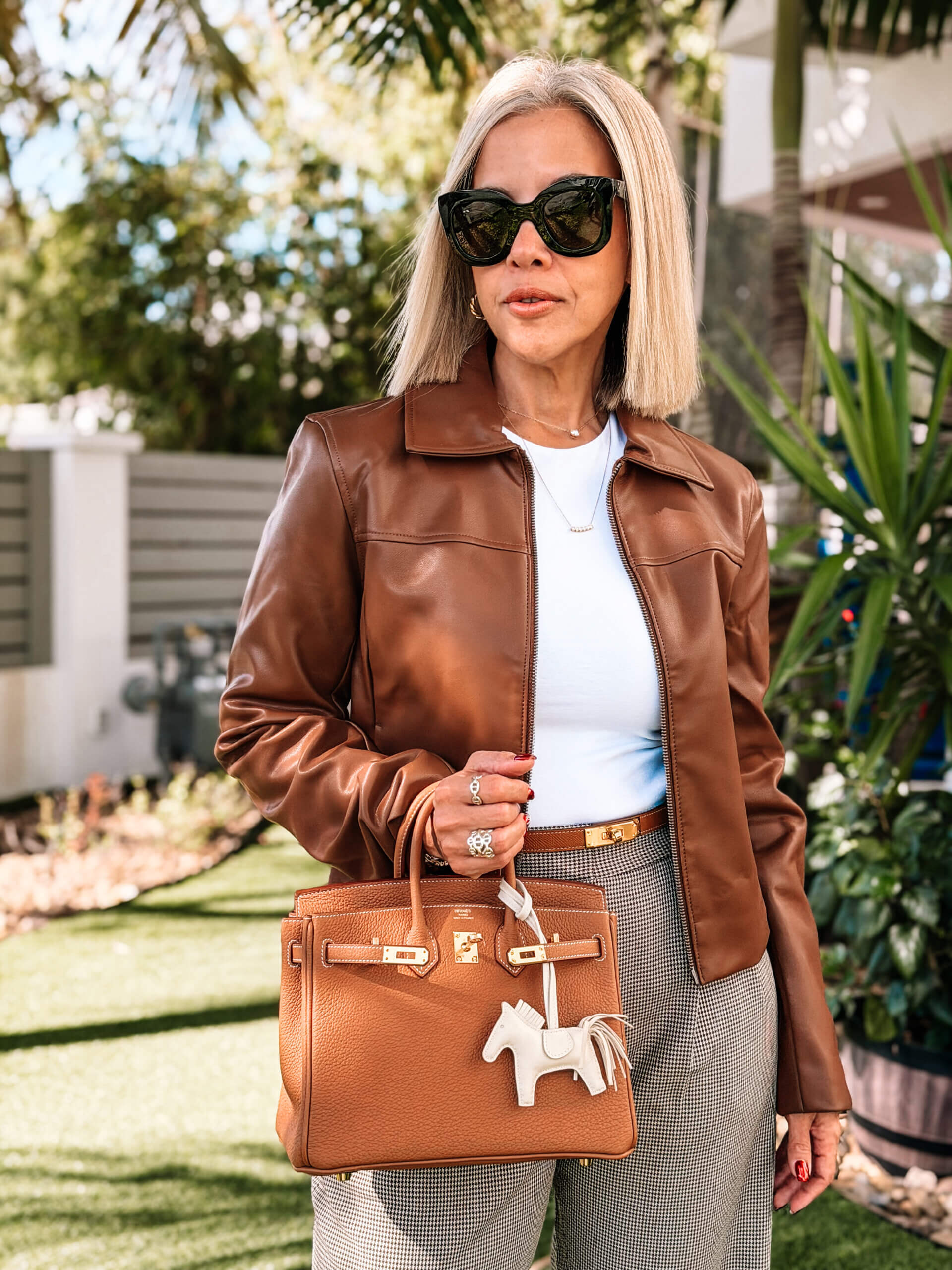
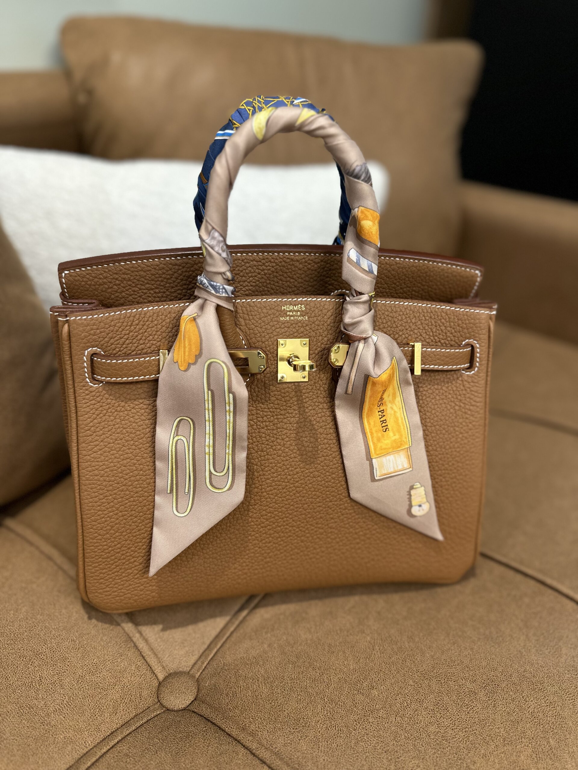
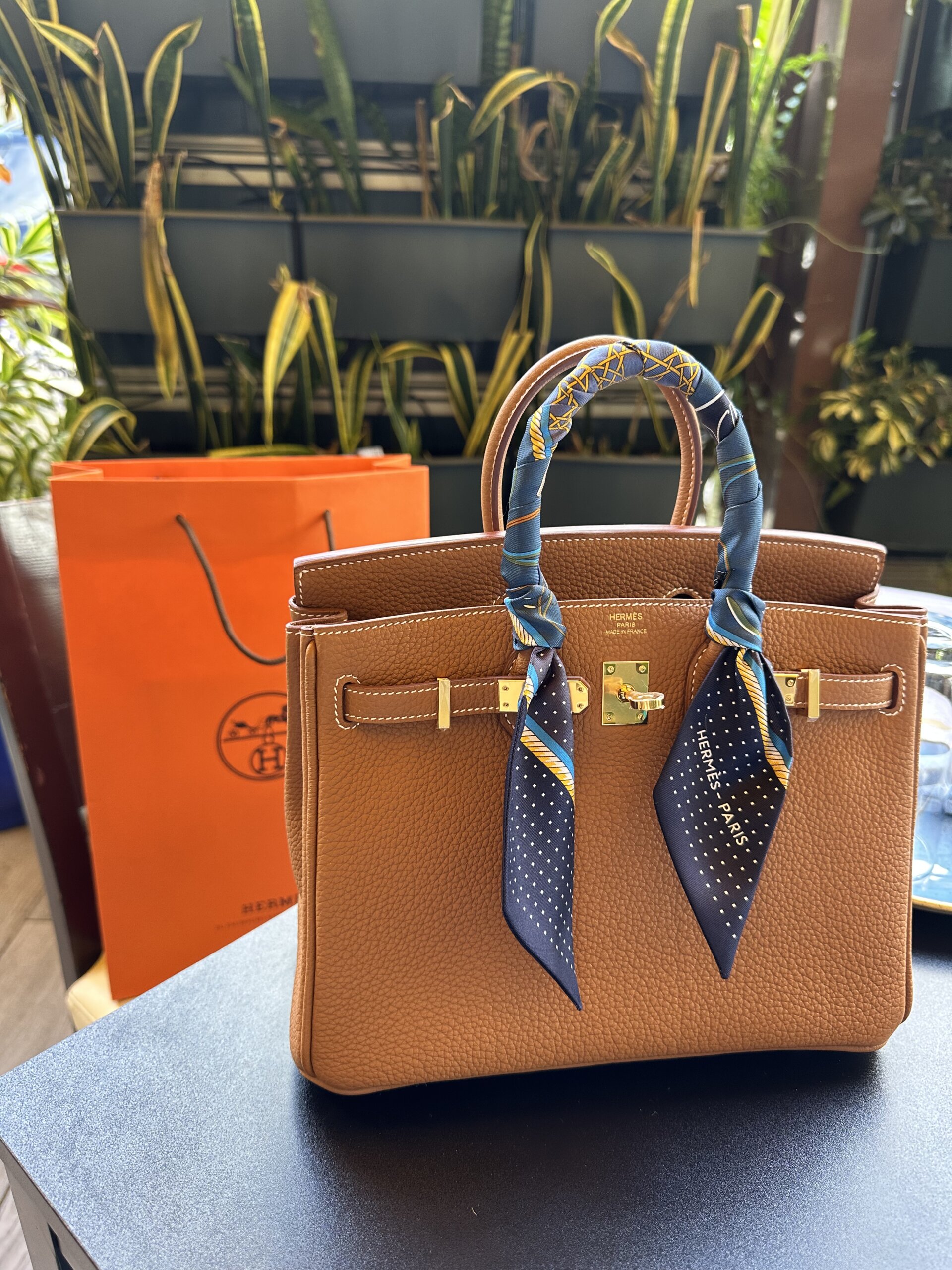
• Gold – My absolute favorite and a true Hermès classic. This warm, rich caramel shade pairs beautifully with both gold and palladium hardware, making it a foolproof first choice. Over time, Gold develops a stunning patina, which only adds to its charm.
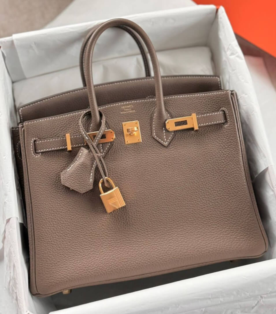
• Etoupe – A cool-toned taupe with gray undertones, this shade is effortlessly elegant. It has a unique ability to complement almost any outfit, which is why it’s so sought after.
• Noir (Black) – The most sophisticated and effortlessly chic option. You can never go wrong with black, especially with gold hardware for that extra luxe touch.
• Béton – A creamy off-white with gray undertones, Béton is an incredibly refined color that still offers more contrast than Craie or Nata.
• Gris Meyer – A newer addition to the Hermès lineup, this cool, soft gray sits somewhere between Etoupe and Gris Tourterelle. It’s subtle, modern, and incredibly easy to style—perfect if you love clean, contemporary neutrals.
• Chai – A warm beige with a hint of caramel, this shade has recently gained major popularity. It’s soft yet striking, and perfect if you want a lighter neutral without going full white.
• Craie – A true chalky off-white, perfect for those who love a light, airy look. However, it’s delicate, so be mindful of color transfer!
• Nata – A creamier, slightly yellow-toned white compared to Craie. It has an almost milky feel and works well with a neutral wardrobe.

Why Choose a Neutral?
✔️ Easier to style – Works with any outfit.
✔️ Timeless & elegant – You’ll never regret it.
✔️ Better resale value – Neutral Hermès bags are always in high demand.
That said, while neutrals are classic and safe, a pop of color can be fun and unique—especially if you already own neutral bags and want something different.

Curated by Lena

Team Pop of Color: Stand Out with a Statement Shade
If you want your first Hermès quota bag to feel extra special and unique, consider a bold, vibrant color. Hermès is known for its exceptional mastery of color, and certain shades have become legendary in the fashion world.
The Most Coveted Pops of Color
• Rouge H – A deep, rich burgundy red that oozes sophistication. If you love classic, muted tones but still want color, this is a fantastic choice. It’s one of the most timeless reds Hermès has ever created.
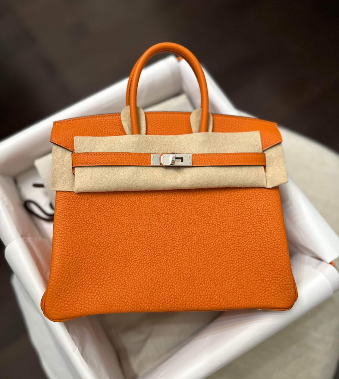
• Orange H – The most iconic Hermès color of all time. If you want a bag that immediately screams Hermès, this is it. Playful yet refined, Orange H is a true collector’s shade.
• Bleu Frida – A stunning cool-toned electric blue that is both striking and elegant. It’s playful yet sophisticated, making it a great option if you want color without being too loud.
• Rose Mexico – A bold, vibrant fuchsia pink that’s impossible to ignore. If you want something energetic, confident, and utterly joyful, this one’s a showstopper. It’s especially striking in smaller styles like the Mini Kelly.
• Vert Criquet – A soft mint green that’s incredibly fresh and modern. It’s a color that works surprisingly well as a neutral.
• Jaune Poussin – A delicate pastel yellow that feels light, bright, and cheery while still being wearable.

Why Choose a Pop of Color?
✔️ Unique and fun – If you already own neutrals, this will add variety.
✔️ Hermès colors are legendary – No other brand does color like Hermès.
✔️ A bright bag can be surprisingly versatile – Especially if your wardrobe leans toward neutrals.
The main downside? Some bold colors can be tricky to style or might not age as well in your collection. If you go for a pop of color, it’s best to pick a shade you truly love.
My Personal Take: Which Should You Choose?
For a first Hermés Quota Bag, I’d personally lean towards a classic neutral like Gold, Etoupe, Noir, or Béton—simply because these shades are forever elegant and effortlessly versatile. Gold remains my top pick because it’s warm, rich, and iconic, but I also love the subtle sophistication of Béton or Chai.
That said, I am open to adding a Mini Kelly or another Birkin in a statement color like Rouge H, Orange H, or Bleu Frida—I just haven’t decided yet! A pop of color can truly make your collection more dynamic, and if it’s a shade you’re drawn to, it’s worth considering.
And here’s the truth: there’s no “right” color, only your color. Nobody—not your husband, not your mom, not even your best friend—gets a say in this one. Only you know what shade makes your heart skip a beat.
So whether it’s a creamy Nata or a fiery Orange H, pick the bag that makes your heart sing, that lights up your wardrobe, fits your lifestyle, and—most importantly—feels like you.
Now tell me… which one is calling your name? 💬✨

More Posts to Read
- Ateliers Auguste Review: A Quiet Luxury Brand Worth Discovering
- Chanel 25 Bag Review: The It Bag Still Dominating in 2026
- Hermes Picotin Review: The Chic Bucket Bag Every Collection Needs
- My Second Hermes Quota Bag: Birkin 25 in Etoupe with Palladium Hardware
- Longchamp Le Pliage Small: The Perfect Daily Tote